I have to agree with Lynce, a stunning bunch of entries! I hope that the next week will be just as popular. My top two were JO53PHS and JazzOn, and I had real hard time choosing. Had to go with JO53PHS in the end.
Ahhh... I really wanted to take part this time but had no time. Just finished the skin for it Thursday night but had absolutely no chance to do the edit yesterday.
While I struggled at first it became clear to me I had to vote JO53PHS.
By the way I would love to see a system that'd let every user choose 0-10 points for every entry.
Instead I'll do this just in case anybody's interested:
Your angle of motion looks weird as if the car was flying sideways at 90°. Also I don't like the blurry dirt or what ever it is I can't identify that covers the whole picture.
Pretty good entry there but I neither like the amount of blur, the usual unrealistic looking rain or the default skin you used. Also it looks stupid with the head lights folded down. The overall composition though is really nice regarding colours and contrasts.
Most of all that's a weird lighting situation. Sky is too dark for day, too bright for a night and too blue for dawn/dusk. Most effects look unrealistic. I like how you tried to light up the rain drops in front of the lamps (which again I don't know why they don't include the standard head lights) but also that is done unrealistic. Also there are left some artefacts from copy&paste. Overall I thought you can to better edits.
Basically this is a pretty good entry, too. From what I see the car is cut out not too accurately but the major "fault" for me is that it isn't really focused that much on the motion of the car. The picture is very static.
Seems to be a pretty spotless edit apart from the colour of the glowing brake disc. Again though this is a picture that suffers from a quite static impression. The car takes a very big space on the picture so there's not much seen from the motion.
In contrast this again looks a bit too dynamic for my taste.^^ If it intended to show a camera going as fast as the car by its side it would be if things were less blurred the farther they are away. If it was intended to show a static camera following the car by turning than the upper and bottom parts of the picture should be blurred in some bent shape. Whether it is the dust looks too static.
This is made quite good although the lights seem a bit unreal. However the debate about "Use only your own work" has changed my opinion. This competition aims to let LFS look as realistic as possible, replacing parts of LFS to achieve that is invalid.
This is also very nicely done and I like to see my skin used by the way.^^ What spoilt it for me is that this skin/livery has not much to do with Audi, Group B or driving through puddles. Also see my comment on brandons48's entry.
Your picture is of high quality. Either way you replicated the snow thrown away very good or you covered very well that you took that snow from the original picture. Position of the car and the lighting used fit the surrounding good. Though see my comment on brandons48's entry.
The dust is not bad but everything else is. The blur chosen is neither very effective nor applied very good, the added lamps on the LX are blurred for appearantly no intended reason and most of all the WRC sign on your plate has not much to do with RWD roadsters or close races of at least three cars.
I have no idea what you did to the shape of the RB4 but it looks very strange. Also the combination of lighting up, then darken down the front again looks bad plus see my comment on brandons48's entry.
One of my few favorites this round. It followed the theme and has just a few minor mistakes (still a bit blur at the B- and C-pillar and at the front splitter, too little blur on the front tyre). It's quite simple but quite good too.^^
Another one of the few entries I favorized. The overall look is very artistic and though the background fits very nice please have a look at my comment on brandons48's entry. Also the motion blur would not have been my choice. It doesn't suit for neither a static camera turning around to follow the car nor for a camera moving parallel to the car.
Well, to explain my edit, which myself I know has a lot of mistakes, I tried to go for the night look.
It failed quite horribly, as I can see afterwards, the lights, were made with a plugin on GIMP and it didnt really look good.
I still thought that it was releaseable, but still had a lot of errors, and unrealism.
The only reason I can make up for this is that I don't really have time for photoediting, or anything anymore(school & apartment weekdays, I only get to play LFS for 2 days a week, I cant really have anything at the other place.) :/
I might look into this, it might be possible with some external poll website
Each entry could be rated with maybe a star rating... it would make it easier in rounds where it is hard to decide on one best picture
EDIT: Google form, with 1 - 5 as radio buttons for each entry.. and then have a formula that calculates an average in the back end. The advantage with this would also be that other peoples' choices do not influence your vote.
Thanks for the votes! Nice theme and pretty darn good edits! Had to go with macsy's edit as it fit the theme well. Some people forgot rally tires and the co-drivers! I didnt need one for my rallycross driver
That debate was there to sort out what exactly the "use your own work" statement meant; Lynce made it clear that its to stop people from using other's work.
Its still your vote, but the disccusion shouldn't affect your vote for this round as no such thing was announced when we did the edits.
I still think that who ever sets the theme should clarify if we can use other sources or simply work with the SS. While the discussion did change my views somewhat, popular themes like "Ice Racing", "Sunset" or "Nature" would hardly be possible.
If restricted to only work with SS's the number of entreis would be drastically reduced (IMO!) and the themes somewhat limited. Hence just let who ever sets the theme decide.
If you have time - have a go with this round's entries. This is one round where one needs mutiple voting (or similar).
PS: People have voted for themselves here. Is there anything that'll restrict them from doing the same in google?
Thx for the feedback !
The intention was indeed a static cam like a journalist covering the top story of the LRC. (even the devs were there)
I never noticed the blur differences. As this was a static cam, i would have had to use more FOV too then, no? I barely look at photographs that close... just enjoyed the cars, but will definitely have an eye on that.
I guess you're right about the dust too. I was on it for 1-2h and probably gone a bit overboard. The first layers looked quite nice and i probably should have stopped there. Recoloring it, it would work as smoke pretty good i guess. With a bit of distance now, the biggest problem for me in the end is, that it's missing a bit detail like rocks and stuff. (wich is a lot easier said than done )
Thx for the votes. When i saw all the real pic edits, i knew the screenshots would have a hard time and are unlikely to win.
As the idea of this competition for me is the editing of screenhots i am gonna vote for either macsy or JOS3PHS, but not sure yet.
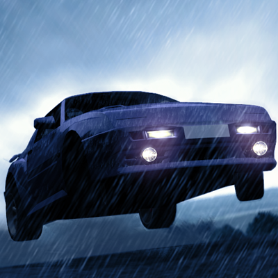
Hm the angle is from a replay i haven't modifyed it it is just a rally jump or kind of lol
anyway the Blur is becouse the theme is Rally IN MOTION but thanks for the comment
Everybody good luck with this competition i wanna say that i like all of the edits! Great work on this round!


 .
. i haven't modifyed it